
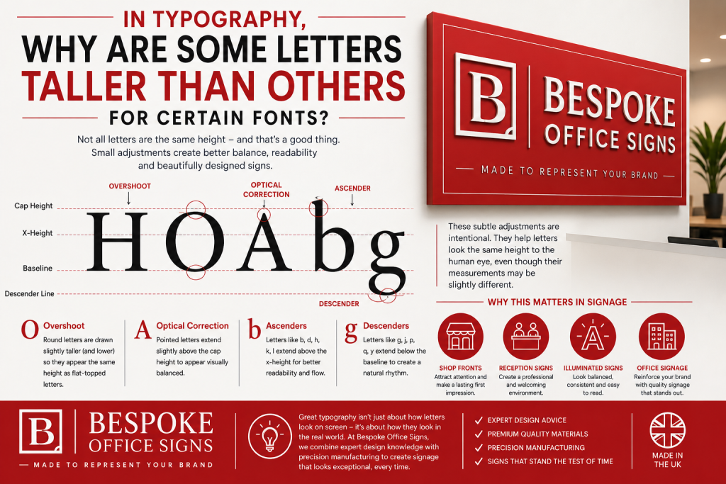
If you’ve ever looked closely at a professionally made sign, you may have noticed that not every letter is exactly the same height. While it might seem unusual, this is actually a deliberate design choice and one of the reasons why high-quality custom office signage looks balanced, professional and easy to read.
Typography is about much more than measurements. Professional fonts are carefully designed so our eyes perceive every letter as being the correct size, even if some characters are physically a little taller or wider than others. These subtle adjustments have been used by type designers for centuries and remain just as important in modern signage.
A good example is the capital H and O. Although they appear to be the same height, the O is usually drawn slightly taller. This is known as overshoot. Rounded shapes naturally appear smaller than flat-edged letters, so designers increase their height very slightly to make them look visually equal.
The same applies to shop letters with pointed tops, such as A and V, which often extend fractionally above the standard capital height. These are known as optical corrections and help create a more balanced appearance.
Lowercase letters also follow similar principles. Characters such as b, d, h, k and l have ascenders, while g, j, p, q and y feature descenders that extend below the baseline. These aren’t mistakes, they’re essential features that improve readability and give each typeface its character.
Why Does This Matter for Signage?
These small details become especially important when it comes to sign manufacturing , If every letter was produced to exactly the same physical height, rounded letters could appear too small and pointed letters could look oversized.
For example, if a customer requests 100mm high lettering:
- An H may measure exactly 100mm.
- An O could measure 101–102mm because of overshoot.
- An A may extend slightly above the cap height due to its pointed top.
Although the measurements differ slightly, the finished custom office sign looks perfectly aligned because the letters are designed to appear equal rather than measure equally.
Typography also affects how easily a sign can be read. A shop fascia viewed from across the road has different requirements to a reception sign viewed from a few feet away. Font choice, spacing and letter proportions all contribute to readability and the overall impression a business creates.
Different Fonts, Different Results
Not every typeface uses the same optical adjustments. Premium serif fonts and luxury branding fonts often exaggerate these features more than clean, modern sans-serif fonts such as Arial or Helvetica. This is why two fonts set at exactly the same size can still look noticeably different once they’re manufactured.
A professional UK sign maker will also consider how a font performs in different materials, whether that’s acrylic lettering, metal signs, vinyl graphics or illuminated signage. A font that looks great on screen isn’t always the best choice once it’s been produced at full size.
Why does professional office signage matters for modern businesses?
At Bespoke Office Signs , we always manufacture lettering as the typeface was intended to be seen. By understanding these subtle typographic details, we produce signs that look balanced, professional and true to our customers’ branding. Most people won’t notice that a rounded O is fractionally taller than a square H, they’ll simply notice that the sign looks right. It’s these small details that help create personalised office signage that leaves a lasting first impression and showcases a business at its very best