
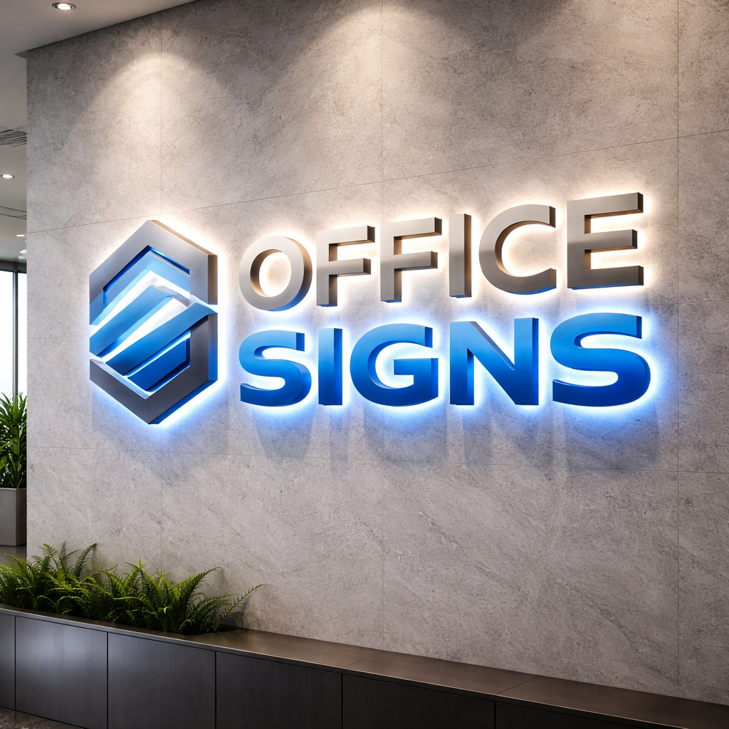
Your office sign is often the very first impression clients, partners and employees have of your business. Before a handshake, before a conversation, your signage speaks. The question is: what is it saying?
As specialists in bespoke office signs, we’ve seen firsthand how the right sign elevates a space — and how the wrong one can quietly undermine a brand. Here are the top five differences between a great office sign and a poor one.
1. First Impressions: Confidence vs Confusion
A great office sign communicates professionalism immediately. It’s clear, well, positioned and aligned with your brand identity. When visitors walk in, they instantly know they’re in the right place — and that they’re dealing with a company that takes itself seriously.
A poor sign, on the other hand, creates doubt. It might be too s mall, poorly lit, outdated or inconsistent with your branding. Instead of reinforcing credibility, it raises subtle questions.
High, quality 3d company logos make a significant difference here. Dimensional lettering adds depth, shadow and presence. Compared to flat vinyl graphics, a 3D finish feels established and premium — not temporary or improvised.
2. Visibility: Impact vs Invisibility
Great signage is designed to be seen. It considers lighting, wall colour, viewing distance and foot traffic flow. Whether positioned in reception, on a feature wall or externally, it stands out without overwhelming the space.
Poor signage often blends into the background. Wrong colour contrast, insufficient scale or poor lighting can make even a good design ineffective.
This is where led signage becomes transformative. Subtle halo illumination or clean backlit lettering ensures your brand remains visible in all lighting conditions. It also adds a contemporary, forward, thinking feel that clients associate with innovation.
If your sign disappears into the wall, so does your opportunity to make an impact.
3. Materials: Premium Craftsmanship vs Cheap Finish
Materials matter more than most businesses realise.
A great office sign uses high, quality materials that reflect your brand’s standards. Precision finishes, smooth edges and durable construction show attention to detail.
Poor signage often relies on thin plastics, peeling vinyl or low, grade substrates that warp, fade or chip over time. This doesn’t just look bad — it suggests carelessness.
Professionally produced custom metal signs acrylic signs offer versatility and durability. Brushed stainless steel delivers authority and permanence. Polished acrylic provides a sleek, modern aesthetic. When fabricated correctly, these materials elevate the entire workspace.
A premium brand should never be represented by budget materials.
4. Brand Alignment: Cohesion vs Contradiction
Your signage should feel like a natural extension of your brand.
Great office signs align perfectly with your typography, colour palette and tone of voice. They reinforce brand recognition at every touchpoint. When someone leaves your office, the visual impression stays with them.
Poor signage often feels disconnected wrong fonts, slightly off, brand colours, inconsistent logo proportions. These details may seem minor, but collectively they dilute brand strength.
Bespoke design ensures your sign isn’t just “a logo on a wall” — it’s a strategic branding asset. From scale to placement, everything is considered to enhance your company’s identity.
5. Longevity: Investment vs Expense
A great office sign is an investment. It’s built to last, designed to grow with your business and capable of adapting to interior updates. It continues to represent your company effectively year after year.
A poor sign becomes an expense. It needs replacing sooner, looks dated quickly or fails to impress important visitors. In many cases, businesses end up paying twice — once for the cheap solution and again for the upgrade.
High, quality fabrication, professional installation and thoughtful design mean your signage keeps delivering value long after it’s fitted.
The Real Difference
The difference between a great office sign and a poor one isn’t just visual — it’s psychological.
One builds trust.
The other erodes it.
One reinforces authority.
The other weakens perception.
When clients step into your office, your signage should reflect the standard of service you provide.
Ready to Elevate Your Space?
If your current signage isn’t making the statement your business deserves, it’s time to rethink it.
We design and manufacture bespoke office signs that combine craftsmanship, brand strategy and precision installation. Whether you’re looking for striking 3D lettering, illuminated features or premium metal and acrylic signage finishes, we create signage that commands attention for the right reasons.
Get in touch today to discuss your project and let’s create an office sign that truly represents your business.
At Bespoke Office Signs, we design and manufacture custom office signage that enhances your workspace and brings your brand to life. Every sign we produce is completely bespoke, tailored to your exact requirements, space, and branding. We offer a range of illumination options including back, illuminated, face, illuminated, halo lit, and LED signage to ensure your business stands out with impact and professionalism.